Skip to Main Content

EDU 107 - Creative Arts for Young Children - Textbook

Chapter 14 | Fine Art Media and Technique (Part II)

Methods

Methods

  •  Students will be able to discuss the growing impact of computers and digital tools on art making of the 21st Century.


1. Carving uses the subtractive process to cut away areas from a larger mass, and is the oldest method used for three-dimensional work. Traditionally stone and wood were the most common materials because they were readily available and extremely durable. Contemporary materials include foam, plastics and glass. Using chisels and other sharp tools, artists carve away material until the ultimate form of the work is achieved.

A beautiful example of the carving process is seen in the Water and Moon Bodhisattva from tenth-century China. The Bodhisattva, a Buddhist figure who has attained enlightenment but decides to stay on earth to teach others, is exquisitely carved and painted. The figure is almost eight feet high, seated in an elegant pose on a lotus bloom, relaxed, staring straight ahead with a calm, benevolent look. The extended right arm and raised knee create a stable triangular composition. The sculptor carves the left arm to simulate muscle tension inherent when it supports the weight of the body.

In another example, you can see the high degree of relief carved from an original cedar wood block in the Earthquake Mask from the Pacific Northwest Coast Kwakwaka’ wakw culture. It’s extraordinary for masks to personify a natural event. This and other mythic figure masks are used in ritual and ceremony dances. The broad areas of paint give a heightened sense of character to this mask.

Earthquake Mask, 9” x 7”, early twentieth century. Kwakwaka’ wakw culture, North American Pacific Coast. Burke Museum, University of Washington, Seattle.


Earthquake Mask, 9” x 7”, early twentieth century. Kwakwaka’ wakw culture, North American Pacific Coast. Burke Museum, University of Washington, Seattle. Used by permission.

Wood sculptures by contemporary artist Ursula von Rydingsvard are carved, glued and even burned. Many are massive, rough vessel forms that carry the visual evidence of their creation.

Michelangelo’s masterpiece statue of David from 1501 is carved and sanded to an idealized form that the artist releases from the massive block, a testament to human aesthetic brilliance.

Michelangelo, David, 1501, marble, 17 feet high. Galleria dell’Accademia, Florence. 


Michelangelo, David, 1501, marble, 17 feet high. Galleria dell’Accademia, Florence. Image in the public domain

2. Casting: The additive method of casting has been in use for more than five thousand years. It’s a manufacturing process by which a liquid material is usually poured into a mold, which contains a hollow cavity of the desired shape, and then allowed to solidify. One traditional method of bronze casting frequently used today is the lost wax process. Casting materials are usually metals but can be various cold-setting materials that cure after mixing two or more components together; examples are epoxy, concrete, plaster, and clay. Casting is most often used for making complex shapes that would be otherwise difficult or uneconomical to make by other methods. It’s a labor-intensive process that allows for the creation of multiples from an original object (similar to the medium of printmaking), each of which is extremely durable and exactly like its predecessor. A mold is usually destroyed after the desired number of castings has been made. Traditionally, bronze statues were placed atop pedestals to signify the importance of the figure depicted. A statue of William Seward (below), the U. S. Secretary of State under Abraham Lincoln and who negotiated the purchase of the Alaska territories, is set nearly eight feet high so viewers must look up at him. Standing next to the globe, he holds a roll of plans in his left hand.

Richard Brooks, William Seward, bronze on stone pedestal, c. 1909. Image by Christopher Gildow.


Richard Brooks, William Seward, bronze on stone pedestal, c. 1909. Image by Christopher Gildow. Used with permission.

More contemporary bronze cast sculptures reflect their subjects through different cultural perspectives. The statue of rock guitarist Jimi Hendrix is set on the ground, his figure cast as if performing on stage. He’s on both of his knees, head thrown back, eyes shut and mouth open in mid wail. His bell-bottom pants, frilly shirt unbuttoned halfway, necklace and headband give us a snapshot of 1960s rock culture but also engage us with the subject at our level.

Daryl Smith, Jimi Hendrix, 1996, bronze. Broadway and Pine, Seattle. Image by Christopher Gildow.


Daryl Smith, Jimi Hendrix, 1996, bronze. Broadway and Pine, Seattle. Image by Christopher Gildow. Used with permission.

Doris Chase was also a strong sculptor. Her large-scale abstract work Changing Form from 1971 is cast in bronze and dominates the area around it. The title refers to the visual experience you get walking around the work, seeing the positive and negative shapes dissolve and recombine with each other.

Doris Chase, Changing Form, 1971. Bronze. Image by Christopher Gildow.


Doris Chase, Changing Form, 1971. Bronze. Image by Christopher Gildow. Used with permission.

3. Modeling is a method that can be both additive and subtractive. The artist uses modeling to build up form with clay, plaster or other soft material that can be pushed, pulled, pinched or poured into place. The material then hardens into the finished work. Larger sculptures created with this method make use of an armature, an underlying structure of wire that sets the physical shape of the work. Although modeling is primarily an additive process, artists do remove material in the process. Modeling a form is often a preliminary step in the casting method. In 2010, Swiss artist Alberto Giacometti’s Walking Man (c. 1955), a bronze sculpture first modeled in clay, set a record for the highest price ever paid for a work of art at auction.

4. Construction, or Assemblage, uses found, manufactured or altered objects to build form. Artists weld, glue, bolt and wire individual pieces together. Sculptor Debra Butterfield transforms throw away objects into abstract sculptures of horses with scrap metal, wood and other found objects. She often casts these constructions in bronze.

Louise Nevelson used cut and shaped pieces of wood, gluing and nailing them together to form fantastic, complex compositions. Painted in a single tone, (usually black or white), her sculptures are graphic, textural façades of shapes, patterns, and shadow.

Traditional African masks often combine different materials. The elaborate Kanaga Mask from Mali uses wood, fibers, animal hide and pigment to construct an other worldly visage that changes from human to animal and back again.

Some modern and contemporary sculptures incorporate movement, light and sound. Kinetic sculptures use ambient air currents or motors allowing them to move, changing in form as the viewer stands in place. The artist Alexander Calder is famous for his mobiles, whimsical, abstract works that are intricately balanced to move at the slightest wisp of air, while the sculptures of Jean Tinguely are contraption-like and, similar to Nevelson’s and Butterfield’s works, constructed of scraps often found in garbage dumps. His motorized works exhibit a mechanical aesthetic as they whir, rock and generate noises. Tinguely’s most famous work,  Homage to New York, ran in the sculpture garden at New York’s Museum of Modern Art in 1960 as part of a performance by the artist. After several minutes, the work exploded and caught fire.

The idea of generating sound as part of three-dimensional works has been utilized for hundreds of years, traditionally in musical instruments that carry a spiritual reference. Contemporary artists use sound to heighten the effect of sculpture or to direct recorded narratives. The cast bronze fountain by George Tsutakawa (below) uses water flow to produce a soft rushing sound. In this instance the sculpture also attracts the viewer by the motion of the water: a clear, fluid addition to an otherwise hard abstract surface.

George Tsutakawa, Fountain. Bronze, running water. City of Seattle. Image by Christopher Gildow.


George Tsutakawa, Fountain. Bronze, running water. City of Seattle. Image by Christopher Gildow. Used with permission.

Doug Hollis’s A Sound Garden from 1982 creates sounds from hollow metal tubes atop gridlike structures rising above the ground. In weathervane fashion, the tubes swing into the wind and resonate to specific pitch. The sound extends the aesthetic value of the work to include the sense of hearing and, together with the metal construction, creates a mechanical and psychological basis for the work.

Installation Art

Dan Flavin is one of the first artists to explore the possibilities of light as a sculptural medium. Since the 1960s his work has incorporated fluorescent bulbs of different colors and in various arrangements. Moreover, he takes advantage of the wall space the light is projected onto, literally blurring the line between traditional sculpture and the more complex medium of installation.

Installation art utilizes multiple objects, often from various mediums, and takes up entire spaces. It can be generic or site specific. Because of their relative complexity, installations can address aesthetic and narrative ideas on a larger scale than traditional sculpture. Its genesis can be traced to the Dada movement, ascendant after World War I and which predicated a new aesthetic by its unconventional nature and ridicule of established tastes and styles. Sculpture came off the pedestal and began to transform entire rooms into works or art. Kurt Schwitters’ Merzbau, begun in 1923, transforms his apartment into an abstract, claustrophobic space that is at once part sculpture and architecture. With installation art the viewer is surrounded by and can become part of the work itself.

British artist Rachel Whiteread’s installation Embankment from 2005 fills an entire exhibition hall with casts made from various sized boxes. At first appearance a snowy mountain landscape navigated by the viewer is actually a gigantic nod to the idea of boxes as receptacles of memory towering above and stacked around them, squeezing them towards the center of the room.

Rachel Whiteread, Embankment, 2005. 


Rachel Whiteread, Embankment, 2005. Source: Wikipedia, licensed through Creative Commons

Ilya Kabakov mixes together a narrative of political propaganda, humor and mundane existence in his installation The Man Who Flew into Space from His Apartment from 1984. What we see is the remains of a small apartment plastered with Soviet era posters, a small bed and the makeshift slingshot a man uses to escape the drudgery of his life within the system. A gaping hole in the roof and his shoes on the floor are evidence enough that he made it into space.

Architecture

Describe traditional methods and materials of building design

Learning Activities

The learning activities for this section include:

  • Reading: Design, Methods, and Materials

Take time to review and reflect on this activity in order to improve your performance on the assessment for this section.

Design, Methods, and Materials

Architecture is an art form that reflects how we present ourselves across the earth’s landscape, and, like other expressive mediums, it changes with styles, technologies and cultural adaptations. Architecture not only provides worldly needs of shelter, workspace and storage but also represents human ideals in buildings like courthouses and government buildings and manifestations of the spirit in churches and cathedrals. Traditional architecture has survived over thousands of years in one form or another, while contemporary design offers new approaches in how we use materials and technology to shape the look of our environment.

Early Developments in Building Design and Techniques Methods

The basic methods of building design and construction have been used for thousands of years. Stacking stones, laying brick, or lashing wood together in one form or another are still used today in all parts of the world. But over the centuries, innovations in methods and materials have given new expression to architecture and the human footprint on the landscape. We can look to historical examples for clues that give context to different style periods.

In western culture, one of the earliest settlements with permanent structures was discovered at Catalhoyuk in Turkey (pictured below). The rich soil that surrounds the settlement indicates the inhabitants relied in part on farming. Dated to about 7500 BCE, the dwellings are constructed from dried mud and brick and show wooden support beams spanning the ceilings. The design of the settlement incorporates a cell-like structure of small buildings either sharing common walls or separated by a few feet. The roofs are flat and were used as pathways between buildings.
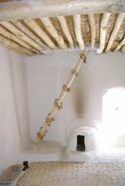
Restoration of interior, Catalhoyuk, Turkey.


Restoration of interior, Catalhoyuk, Turkey. Image licensed under Creative Commons.

A significant advance came with the development of the post and lintel system. With this, a system of posts –either stone or wood – are placed at intervals and spanned by beams at the tops. The load is distributed down the posts to allow for areas of open space between them. Its earliest use is seen at Stonehenge (below), a prehistoric monument in southern England dating to about 3000 BCE.
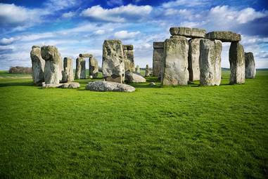
Stonehenge, Wiltshire County, England. Image: David Ball. 


Stonehenge, Wiltshire County, England. Image: David Ball. Image licensed under Creative Commons.


Post and Lintel support in contemporary use. Image by Christopher Gildow.


Post and Lintel support in contemporary use. Image by Christopher Gildow. Used with permission.

A colonnade continues the post and lintel method as a series of columns and beams enveloping larger areas of space. Colonnades can be free standing or part of a larger structure. Common in Egyptian, Greek and Roman architectural design, their use creates visual rhythm and implies a sense of grandeur. Over time columns became categorized by the capital style at their tops. The smooth and unadorned Tuscan and fluted Doric columns give way to more elaborate styles: the scrolled Ionian and the high relief Corinthian.
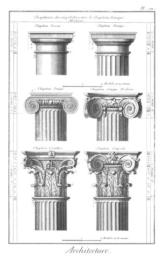
Greek and Roman capitals: Top row:  Tuscan, Doric. Middle Row: Ionic. Bottom Row: Corinthian and a composite Ionic Corinthian. Classical Orders, engraving from the Encyclopédie vol. 18.


Greek and Roman capitals: Top row:  Tuscan, Doric. Middle Row: Ionic. Bottom Row: Corinthian and a composite Ionic Corinthian. Classical Orders, engraving from the Encyclopédie vol. 18. Public domain.

The Parthenon, a Greek temple to the mythic goddess Athena, was built in the fifth century BCE in Athens and is part of a larger community of structures in the Acropolis. All are considered pinnacles of classic Greek architecture. Ionic colonnades march across all sides of the Parthenon, the outer boundary of a very ordered interior floor plan.
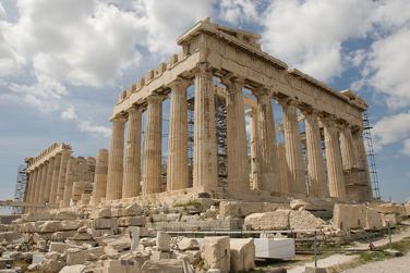
The Parthenon, Athens, Greece. 447 BCE.


The Parthenon, Athens, Greece. 447 BCE. Digital image by Kallistos and licensed under Creative Commons

Floor plan of the Parthenon.


Floor plan of the Parthenon. Licensed through Creative Commons.


Another example is the colonnade surrounding St. Peter’s Square in the Vatican, Rome.

Gian Lorenzo Bernini, Colonnade at St. Peter’s Square, the Vatican. 1656–67. Photo by D.F. Malan. 


Gian Lorenzo Bernini, Colonnade at St. Peter’s Square, the Vatican. 1656–67. Photo by D.F. Malan. Licensed through Creative Commons.

The colonnade is part of our contemporary surroundings too. Parks and other public spaces use them to the same effect: providing visual and material stability in spanning areas of open space.
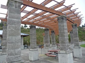
Contemporary colonnade.


Contemporary colonnade. Image: Christopher Gildow. Used with permission.

The development of the arch gave architecture new alternatives to post and lintel construction. Arches appeared as early as the 2nd millennium BC in Mesopotamian brick architecture. They supply strength and stability to walls without massive posts and beams because their construction minimizes the shear load imposed on them. This meant walls could go higher without compromising their stability and at the same time create larger areas of open space between arches. In addition, the arch gave buildings a more organic, expressive visual element. The Colosseum in Rome (below), built in the first century CE, uses repeated arches to define an imposing but decidedly airy structure. The fact that it’s still standing today is testament to the inherent strength of the arch.
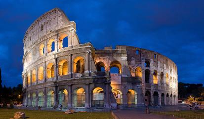
The Colosseum, Rome, Italy. First century CE. Photo by David Iliff. 


The Colosseum, Rome, Italy. First century CE. Photo by David Iliff. Image licensed through Creative Commons.

Roman aqueducts are another example of how effectively the arch was used. Tall and graceful, the arches support themselves in a colonnade and were used to transport a network of water channels throughout ancient Rome.
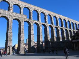
Roman aqueduct, c. First century CE. 


Roman aqueduct, c. First century CE. Image in the public domain.

From the arch came two more important developments: extending an arch in a linear direction formed a vault, encapsulating tall, narrow spaces with inverted “U” shaped ceilings. The compressive force of the vault required thick walls on each side to keep it from collapsing. Because of this many vaults were situated underground – essentially tunnels – connecting areas of a larger building or providing covered transport of people, goods and materials throughout the city.

An arch rotated on its vertical axis creates a dome, with its curving organic scoop of space reserved for the tops of the most important buildings. The Pantheon in Rome sports a dome with an oculus – a round or elliptical opening at the top, that is the massive building’s only light source.
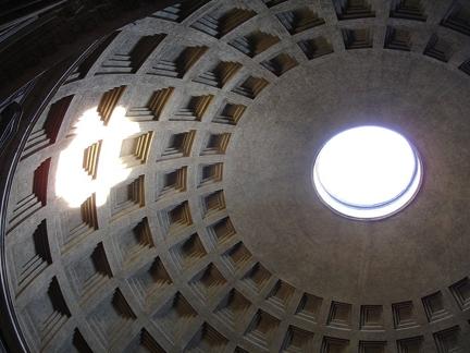
Dome of the Pantheon with oculus, Rome. 126 CE. 


Dome of the Pantheon with oculus, Rome. 126 CE. Image in the public domain.

These elements combined to revolutionize architectural design throughout Europe and the Middle East in the form of bigger and stronger churches, mosques and even sectarian government buildings. Styles changed with technology. Romanesque architecture was popular for nearly three hundred years (800 – 1100 CE). The style is characterized by barrel or groin vault ceilings, thick walls with low exterior buttresses and squared off towers. Buildings reached a point where they struggled to support their own weight. The architectural solution to the problem was a flying buttress, an exterior load-bearing column connected to the main structure by a segmented arch or “flyer.”
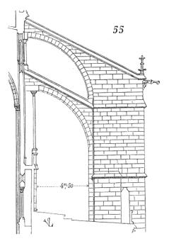
Diagram of a flying buttress from St. Denis basilica, Paris. 


Diagram of a flying buttress from St. Denis basilica, Paris. From the Dictionary of French Architecture from 11th to 16th Century (1856), licensed through Creative Commons.

Flying buttresses became a kind of exoskeleton that transferred the heavy weight of Romanesque stone roofs through their arches and into the ground, away from the building. They became catalysts for the Gothic style based on higher, thinner walls, pointed arches, ribbed vaults, and spired towers. Also, the thinner walls of the Gothic style allowed for more stained glass windows and interior illumination.
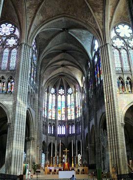
Church of St. Denis, France. Seventh–twelfth centuries CE. 


Church of St. Denis, France. Seventh–twelfth centuries CE. Image in the public domain

St. Denis basilica in France (above) is one of the first Gothic-style churches, known for its high vaulted ceilings and extensive use of stained glass windows. The architecture of the church became a symbol of spirituality itself: soaring heights, magnificently embellished interiors and exteriors, elaborate lighting and sheer grandeur on a massive scale.

The Doges Palace in Venice, Italy (pictured below) housed the political aristocracy of the Republic of Venice for a thousand years. Built in 1309 CE, its rhythmic levels of columns and pointed arches, divided by fractals as they rise, give way to elaborate geometric patterns in the pink brick façade. The ornamental additions at the top edge reinforce the patterns below.
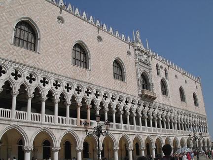
The Doges Palace, 1309 CE, viewed from St. Mark’s Square, Venice, Italy.


The Doges Palace, 1309 CE, viewed from St. Mark’s Square, Venice, Italy. Image by Martti Mustonen and licensed through Creative Commons.

ARCHITECTURE IN CHINA & THE FAR EAST

Chinese architecture refers to a style of architecture that has taken shape in East Asia over many centuries. The structural principles of traditional Chinese architecture have remained largely unchanged. Chinese architectural (and aesthetic) design is based on symmetry, a general emphasis on the horizontal and site layouts that reflect a hierarchy of importance. These considerations result in formal and stylistic differences in comparison to the West, and display alternatives in design.

The Chinese have used stone, brick and wood for centuries. The Great Wall, begun in the 5th century BCE, was intended to keep nomadic invaders out of Northern China. The stone wall covers 5500 miles in its entirety. The rigid material takes on a more flexible appearance as it conforms to the contours of the landscape surrounding it. 

CROSS-CULTURAL INFLUENCES

As overland and marine trade routes expanded between Eastern and Western civilizations so did the influence of cultural styles in architecture, religion and commerce. The most important of these passages was the Silk Road, a system of routes that developed over hundreds of years across the European and Asian continents. Along this route are buildings that show cross-cultural influences in their design. 

The Dome of the Rock in Jerusalem offers different cultural influences manifest in one building: a classic Greek colonnade at the main entrance, the gold dome and central turret supporting it, western style arches and colorful Islamic surface embellishment.

The Dome of the Rock, on the Temple Mount,  in the Old City of Jerusalem


The Dome of the Rock, on the Temple Mount, in the Old City of Jerusalem, Photo Credit Andrew Shiva, Image licensed through

Creative Commons

The Louvre Palace in Paris, once the official royal residence and now one of the world’s biggest museums, had its beginnings in the 12th century but didn’t achieve its present form until recently. The building’s style is French Renaissance – marked by a formal symmetry, horizontal stability and restrained ornamentation. The Louvre executive board chose architect I. M. Pei’s glass pyramid design as the defining element for the new main entry in 1989. The choice was a great success: the pyramid further defines the public space above ground and gives natural light and a sense of openness to the underground lobby beneath it.

THE INDUSTRIAL REVOLUTION

Beginning in the 18th century the Industrial Revolution made fundamental changes in agriculture, manufacturing, transportation and housing. Architecture changed in response to the new industrial landscape. Prior to the late 19th century, the weight of a multistory building had to be supported principally by the strength of its walls. The taller the building, the more strain this placed on the lower sections. Since there were clear engineering limits to the weight such load-bearing walls could sustain, large designs meant massively thick walls on the ground floors, and definite limits on the building’s height.

Eiffel Tower, Start of construction of second stage, May 1888


Eiffel Tower, Start of construction of second stage, May 1888. Image in the public domain

Forged iron and milled steel began to replace wood, brick and stone as primary materials for large buildings. This change is encapsulated in the Eiffel Tower, built in 1889. Standing on four huge arched legs, the iron lattice tower rises narrowly to just over 1000 feet high. The Eiffel Tower not only became an icon for France but for industry itself – heralding a new age in materials, design and construction methods.

In America, the development of cheap, versatile steel in the second half of the 19th century helped change the urban landscape. The country was in the midst of rapid social and economic growth that made for great opportunities in architectural design. A much more urbanized society was forming and the society called out for new, larger buildings. By the middle of the 19th century downtown areas in big cities began to transform themselves with new roads and buildings to accommodate the growth. The mass production of steel was the main driving force behind the ability to build skyscrapers during the mid 1880s.

Steel framing was set into foundations of reinforced concrete, concrete poured around a grid of steel rods (re-bar) or other matrices to increase tensile strength in foundations, columns and vertical slabs.

MODERNIST ARCHITECTURE

The move to modernism was introduced with the opening of the Bauhaus school in Weimar Germany. Founded in 1919 by the German architect Walter Gropius, Bauhaus (literal translation “house of construction”) was a teaching and learning center for modern industrial and architectural design. Though not a movement or style in itself, Bauhaus instructors and staff reflected different artistic perspectives, all of them born from the modern aesthetic. It was partly the product of a post- World War I search for new artistic definitions in Europe. Gropius’s commitment to the principle of bringing all the arts together with a focus on practical, utilitarian applications. This view rejected the notion of “art for art’s sake”, putting a premium on the knowledge of materials and their effective design. This idea shows the influence of Constructivism, a similar philosophy developed concurrently in Russia that used the arts for social purposes. Bauhaus existed for fourteen years, relocating three times, and influencing a whole generation of architects, artists, graphic and industrial designers and typographers.

In 1924 Gropius designed the Bauhaus main building in Dessau. Its modern form includes bold lines, an asymmetric balance and curtain walls of glass. It’s painted in neutral tones of white and gray accented by strong primary colors on selected doors.

Bauhaus (built 1925–26) in Dessau, Germany


Bauhaus in Dessau, Germany, 1925-26, Image in public domain

Frank Lloyd Wright is considered one of the 20th century’s greatest architects. Wright designed buildings, churches, homes and schools, but is best known for his design of Falling Water, a home in the Pennsylvania countryside for Chicago department store owner Edgar Kaufman. His design innovations include unified open floor plans, a balance of traditional and modern materials and the use of cantilevered forms that extends horizontal balance.

The Guggenheim Museum in New York City is an example of Wright’s concern with organic forms and utilization of space. The main element in the design is a spiral form rising from the middle of the cantilevered main structure. Paintings are exhibited on its curved walls. Visitors take the elevator to the top floor and view the works as they travel down the gently sloped hallway. This spiral surrounds a large atrium in the middle of the building and a domed skylight at the top.

Atrium, Solomon R. Guggenheim Museum, Manhattan, New York, 1959


Atrium, Solomon R. Guggenheim Museum, Manhattan, New York, 1959, Image in the public domain

POST MODERN & CONTEMPORARY ARCHITECTURE

Postmodern architecture began as an international style whose first examples are generally cited as being from the 1950s, but did not become a movement until the late 1970s and continues to influence present-day architecture. Postmodernity in architecture is generally thought to be heralded by the return of “wit, ornament and reference” to architecture in response to the formalism of the International Style.

Michael Graves’s Portland Building from 1982 personifies the idea behind postmodernist thought. A reference to more traditional style is evident in the patterned column-like sections. Overt large-scale decorative elements are built into and onto the exterior walls, and contrasts between materials, colors and forms give the building a graphic sense of visual wit.

We can see how architecture is actively evolving in the contemporary work of Frank Gehry and Zaha Hadid. Gehry’s work is famous for its rolling and bent organic forms. His gestural, erratic sketches are transformed into buildings through a computer aided design process (CAD). They have roots in postmodernism but lean towards a completely new modern style. They have as much to do with sculpture as they do with architecture. Seattle’s Experience Music Project is an example of the complexity that goes into his designs. Its curves, ripples and folds roll across space and the multi-colored titanium panels adorning the exterior accentuate the effect. 

GREEN ARCHITECTURE

In the last decade there has emerged a strong interest in developing “green” architecture – designs that incorporate ecologically and environmentally sustainable practices in site preparation, materials, energy use and waste systems. Some are simple: buildings oriented to the south or west helps with passive solar heating. Others are more complex: Solar voltaic cells on the roof to generate power to the building. Green roofs are made of sod and other organic material and act as a cooling agent and recycle rainwater too. In addition, technological innovations in lighting, heating and cooling systems have made them more efficient.

A branch of the Seattle Public Library uses green design. A glass curtain wall on the north side makes use of natural lighting. Overhanging wooden roof beams shades harsh light. The whole structure is nestled under a green roof of sod and over 18,000 low water use plants. Seven skylights on the roof provide more natural lighting.

Time-Based Art

Explain the techniques of film and video art

Learning Activities

The learning activities for this section include:

  • Reading: Time-Based Media: Film and Video

Take time to review and reflect on this activity in order to improve your performance on the assessment for this section.

Time-Based Media: Film and Video

With traditional film, what we see as a continuous moving image is actually a linear progression of still photos on a single reel that pass through a lens at a certain rate of speed and are projected onto a screen. We saw a simple form of this process earlier in the pioneering work of Eadweard Muybridge.

Twelve film stills showing a horse and rider jump over a gate.


Eadweard Muybridge, Sequence of a Horse Jumping, 1904. Image is in the public domain

The first motion picture cameras were invented in Europe during the late nineteenth century. These early “movies” lacked a soundtrack and were normally shown along with a live pianist, organ player or orchestra in the theatre to provide the musical accompaniment. In the United States, film went from being a novelty to an art form with D. W. Griffith’s Birth of a Nation in 1915. In it Griffith presents a narrative of the Civil War and its aftermath but with a decidedly racist view of American blacks and the Ku Klux Klan.

Film scholars agree it contains many new cinematic innovations and refinements, technical effects and artistic advancements, including a color sequence at the end. It had a formative influence on future films and has had a recognized impact on film history and the development of film as art. In addition, at almost three hours in length, it was the longest film to date (from Filmsite Movie Review: The Birth of a Nation).

Unique to the moving image is its ability to unfold an idea or narrative over time, using the same elements and principles inherent in any artistic medium. Film stills show how dramatic use of lighting, staging and set compositions are embedded throughout an entire film.

Video art, first appearing in the 1960s and 70s, uses magnetic tape to record image and sound together. The advantage of video over film is its instant playback and editing capability. One of the pioneers in using video as an art form was Doris Chase. She began by integrating her sculptures with interactive dancers, using special effects to create dreamlike work, and spoke of her ideas in terms of painting with light. Unlike filmmakers, video artists frequently combine their medium with installation, an art form that uses entire rooms or other specific spaces, to achieve effects beyond mere projection. South Korean video artist Nam June Paik made breakthrough works that comment on culture, technology and politics. Contemporary video artist Bill Viola creates work that is more painterly and physically dramatic, often training the camera on figures within a staged set or spotlighted figures in dark surroundings as they act out emotional gestures and expressions in slow motion. Indeed, his work The Greeting reenacts the emotional embrace seen in the Italian Renaissance painter Jocopo Pontormo’s work The Visitation below.

Jacopo Pontormo, The Visitation, 1528, oil on canvas. The Church of San Francesco e Michele, Carmignano, Italy. 


Jacopo Pontormo, The Visitation, 1528, oil on canvas. The Church of San Francesco e Michele, Carmignano, Italy. Image is in the public domain.

Digital Technology and Art of the 21st Century

Digital Technology and Art of the 21st Century

Visitors at The Museum of Modern Art in front of Julie Mehretu, Empirical Construction, Istanbul, 2003. Ink and synthetic polymer paint on canvas, 10' x 15' (304.8 x 457.2 cm).


Visitors at The Museum of Modern Art in front of Julie Mehretu, Empirical Construction, Istanbul, 2003. Ink and synthetic polymer paint on canvas, 10′ x 15′ (304.8 x 457.2 cm). Photo: thatgirl

Introduction

Twenty-first-century art is a burgeoning field of practice, research, and publication, making it an incredibly dynamic field of study. Many important topics have been resonating in the new century and inspiring new thinking and scholarly debate, such as the surge of bio art in response to scientific research in the life sciences, and the critical theory known as relational aesthetics that developed in response to an increase in art that invites viewers’ participation and interaction. Other topics that were much-discussed in the late twentieth century remain vital for the analysis of twenty-first-century art and visual culture, including semiotics, post-modernism, and feminism.

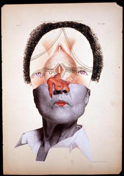
Wangechi Mutu, Complete Prolapsus of the Uterus, 2004, Glitter, ink, collage on found medical illustration paper, 46 x 31cm


Wangechi Mutu, Complete Prolapsus of the Uterus, 2004, Glitter, ink, collage on found medical illustration paper, 46 x 31cm

Art of the twenty-first century emerges from a vast variety of materials and means. These include the latest electronic technologies, such as digital imaging and the Internet; familiar genres with a long history that continue to be practiced with great vigor, such as painting (see, for example, the work of Julie Mehretu and Shahzia Sikander); and materials and processes once associated primarily with handicrafts, re-envisioned to express new concepts. Many artists regularly and freely mix media and forms, making the choices that best serve their concepts and purposes. Activities vary from spectacular projects accomplished with huge budgets and extraordinary production values to modest endeavors that emphasize process, ephemeral experiences, and a do-it-yourself approach. The notion of influences has also shifted with changes in communications and technology; every location around the world has artists who respond to local geographies and histories as well as the sway of global visual culture.

Computers and digital technology

Like the camera did more than one hundred and fifty years ago, computers and digital technology have revolutionized the visual art landscape. Some artists now use digital technology to extend the reach of creative possibilities. Sophisticated software allows any computer user the opportunity to create and manipulate images and information. From still images and animation to streaming digital content and digital installations, computers have become high tech creative tools.

In a blending of traditional and new media, artist Chris Finley uses digital templates—software-based composition formats—to create his paintings.

The work of German artist Jochem Hendricks combines digital technology and human sight. His eye drawings rely on a computer interface to translate the process of looking into physical drawings.

Digital technology is a big part of the video and motion picture industries with the capability for high definition images, better editing resources and more areas for exploration to the artist.

The camera arts are relatively new mediums to the world of art but their contributions are perhaps the most significant of all. They are certainly the most complex. Like traditional mediums of drawing, painting and sculpture they allow creative exploration of ideas and the making of objects and images. The difference is in their avenue of expression: by recording images and experiences through light and electronics they, on the one hand, narrow the gap between the worlds of the “real” and the “imagined” and on the other offers us an art form that can invent its own reality with the inclusion of the dimension of time. We watch as a narrative unfolds in front of our eyes. Digital technology has created a whole new kind of spatial dimension: cyberspace.

Globalization

A key feature of the art scene in the twenty-first century (and of many sectors of twenty-first-century life) is the impact of globalization – the accelerating interconnectivity of human activity and information across time and space. Aided by the internet and mass media, awareness of the vitality of contemporary art in localities around the globe has grown exponentially. Anyone with access to the internet can follow developments in Shanghai, Sydney, São Paulo, or Nairobi. Simultaneously the increased movement of artists across borders and oceans has added to the intermixing of influences and artistic vocabularies. For example, Wangechi Mutu, originally from Kenya, pursued further education in South Wales and then in the United States. Her collaged images of women are informed by African tribal arts, 20th-century European and American collage artists, and the latest illustrations from fashion, pornography, and medical sources.

The meaning and consequences of globalization are much debated by scholars. Economically and politically, is globalization a force for growth and freedom in societies everywhere, or does it contribute to further exploitation of developing regions by the wealthy? Does globalization work in different ways in different localities?

Regarding globalization and art, do practices in Asia, Africa, the Middle East, and elsewhere challenge the traditional assumptions and value judgments that are the basis of the Western canon? Are Western institutions rethinking that canon or simply adding art from other places to their rosters in a token and uncritical gesture of inclusivity? How do curated exhibitions that address themes of globalization represent artists from various parts of the world? The expanding art market and the proliferation of biennials and art fairs helped a select group of artists from every continent to gain an international presence; but have the underlying structure and values of the art market changed otherwise?

Visual Culture

In the twenty-first century visual culture has grown as a recognized interdisciplinary field of study, taking a multifaceted approach to understanding how images of all types communicate and participate in the construction of identity, gender, class, power relationships, and other social and political meanings and values. Medicine, science, politics, consumer culture, and religion and spirituality are some of the arenas that visual culture studies examine along with art. Visual culture scholars analyze film, television, graphic novels, fashion design, and other forms of popular culture in addition to established fine art media such as painting, and they draw upon many methodologies and theories, including semiotics, sociology, psychoanalysis, reception theory, feminism, and the concept of the gaze, to name a few.

Just as visual culture scholars are examining images and media of all types so, too, are twenty-first-century artists drawing inspiration, imagery, materials, and concepts from diverse areas of culture, moving well beyond influences from the history of fine art and design. The world of professional sports and fanatic fans has been a topic for Paul Pfeiffer, while the commercial television industry has informed various video installations by Christian Jankowski.

Most contemporary artists do not draw rigid distinctions between high art and popular culture. For instance, a number of contemporary artists embrace traditional techniques of fiber art but use them to create unorthodox forms or address current social and political issues. Along these lines, Ghada Amer has used thread to embroider on canvas repeated motifs of nude women engaged in sexual acts, then partially obscured the embroidered images with gestural painted brushstrokes. Her themes include the expression and repression of female sexuality and eroticism in both Western and Islamic societies. Another example of intermixing visual cultures is the complex array of interactions between science and contemporary art, with many artists engaging with scientific imagery and ideas in their practice. For example, Wim Delvoye’s ongoing series called Cloaca imagines humans as cyborgs, representing the human digestive system as a kind of biomechanical contraption. Finally, many twenty-first-century artists are deeply affected by their immersion in global visual culture, which is now made vividly present through online networks. Many artists maintain a personal website, and some create art expressly for dissemination through social media. As always, new technologies provide new opportunities and challenges.

Public and Participatory Art

Public art was a well-established genre by the late twentieth century, attracting both traditional and experimental practitioners. Public art in the twenty-first century has expanded even more as a field of activity in which creative investigation can take place. In addition to continuing familiar forms such as site-specific monuments, murals, graffiti, and collaborations between artists, engineers, and architects, public art encompasses new purposes, forms, and locations, including pop-up art shops, street parades, and online projects. Public artists in the twenty-first century might use established approaches such as installation and performance but introduce new variations. For instance, it is now common for artists to hire other people, sometimes with special skills, to undertake performances on their behalf. In this vein, Vanessa Beecroft hired fashion models for performances, and the collaborative artists Allora & Caldazilla directed professional athletes as performers in some of their installations.

A pronounced tendency in the twenty-first century has been art that is participatory, in which the social interactions prompted by a work become its content. Often called relational art, the work literally engages the public in some way. For instance, Carsten Höller has installed giant slides in museums for visitors to slide down, and Rirkrit Tiravanija has prepared Thai food and served it to gallery goers. Artists attracted by the immediacy and connectivity of globally networked media often create online projects that invite social interaction. Relational aesthetics has developed (and been contested) as a critical theory for analyzing and evaluating such undertakings. Key questions in these debates include: Does it matter if the social interactions prompted by such works promote a better world or are conviviality and entertainment sufficient goals? To what extent should the physical products of relational art (such as Höller’s slides) be evaluated aesthetically as well as for their social effects?

The twenty-first century is just beginning – issues and ideas are evolving rapidly and new artists are constantly gaining attention and influence.

*The content was first developed for Oxford Art Online and appears courtesy of Oxford University Press. Visit to learn more about contemporary art and see a list of significant twenty-first-century artists.

Putting It Together

In this module we discussed the following:

  •       the basic techniques of drawing, painting, photography, and printmaking;
  •       additive and subtractive sculpture techniques;
  •       methods and materials in building design;
  •       techniques and challenges of film and video;
  •       and the growing impact of computers and digital tools on art making.

The creative process is a kind of critical thinking (Sayre, 3). It involves visual research, trial and error, being open to new information, evaluating results, and being self-critical. The medium or mixed-media are the raw materials that an artist uses to make their idea come to life.

Each medium has its own unique visual effects or characteristics. In the viewer context we read these unique visual effects and draw specific meanings from them. Photography, for example, has the ability to render a selection of life in such realistic detail that it is used in non-artistic practices for evidence collection. Even though Photoshop has become part of our vernacular in the Western world, and we know photographs can be manipulated, if we were to see a photograph of a courtroom scene our first inclination would be that it is a factual record of that moment, as opposed to an artist’s drawn rendering, which has a very different set of visual effects.

Works Cited

Sayre, Henry. A World of Art, Sixth edition. Boston: Prentice Hall, 2010. Print.